Circular Progress Bar
The Circular Progress Bar Control is a Display control used for indicating the percentage progress of an action or activity in the form of a circular graph.

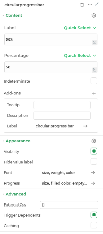
Content
label
Represents the label or text displayed on the left side of the progress bar.
Percentage
Indicates the percentage value for the progress.
Indeterminate
The circular progress bar spins continuously or animates in a loop. It indicates that a task is in progress, but no specific progress percentage can be shown.
Add-ons
| Add-on | Description |
|---|---|
| Tooltip | Provides helpful hints or extra information on hover. |
| Description | Adds descriptive text beneath options or sections. |
| Label | Displays labels for specific options or sections. Configurable with size, weight, and color. |
Appearance
- Visibility – Controls whether the element is shown or hidden in the interface.
- Hide value label - Toggle this yo hide and show label and values of the control.
- Font : Properties for the label in the center of the circular progress bar.
- Progress : Customizes the look of the circular progress bar control.
Advanced Settings
- External CSS: Add custom styles to the Link control.
- Trigger Dependents: Automatically invoke linked controls or workflows.
- Caching: Enable caching to store frequently used inputs.