Color Picker
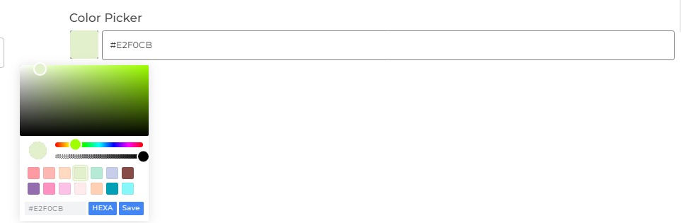
The Color Picker control provides users with the ability to choose colors visually from a spectrum or predefined color palettes. This control is commonly used in applications that require users to select specific colors for various design or visualization purposes.
Content
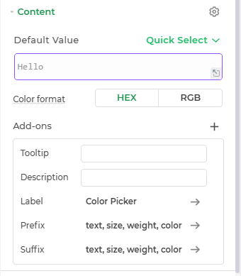
Default
This is where you can provide the default color value for the Color Picker Control.
Color Format
Set the format between RGB and Hex for the control.
Add-ons
| Add-on | Description |
|---|---|
| Tooltip | Provides helpful hints or extra information on hover. |
| Description | Adds descriptive text beneath options or sections. |
| Label | Displays labels for specific options or sections. Configurable with size, weight, and color. |
| Prefix | Adds an icon or text before the field content. Configurable with size, weight, and color. |
| Suffix | Adds an icon or text after the field content. Configurable with size, weight, and color. |
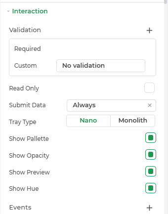
Interaction
| Property | Description |
|---|---|
| Validation | Defines to make this field as types Required. |
| Read Only | Makes the input field non-editable. The user can view the content but cannot modify it. |
| Submit Data | Determines whether the field's value should be included in form submission. Options include Always, Never, and Not When hidden. |
| Show Barcode Scanner | Displays a barcode scanner icon that lets users input values by scanning barcode. |
| Debounce Time (In ms) | Sets a delay (in milliseconds) to wait after user input before triggering events like search or API calls. Helps reduce unnecessary calls. |
| Show Raw Data | Displays the raw unprocessed data value behind the input (useful for debugging or viewing bound values). |
| Show Palette | Enables the display of a palette for easy color selection. |
| Show Opacity | Allows users to adjust the opacity of the selected color. |
| Show Preview | Displays a preview of the chosen color. |
| Show Hue | Shows the hue selector for more precise color choice. |
| Tray Type | The Color Picker control offers different tray types, such as Nano, to streamline the color selection process. |
| Events | Allows configuration of actions (like workflows or bindings) to trigger based on user interactions, such as input change, focus, or press enter. |
Events
The Color Picker control triggers the following events:
| Trigger | Description |
|---|---|
| value_change | Occurs when there is a change in the value of the respective control, typically triggered by selecting or changing a color. |
Events
The Color Picker control triggers the following events:
| Trigger | Description |
|---|---|
| value_change | Occurs when there is a change in the value of the respective control, typically triggered by selecting or changing a color. |
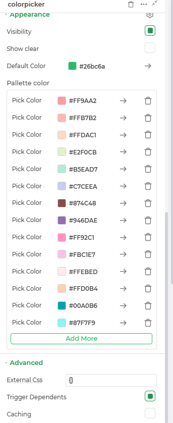
Appearance
Visibility: Toggle the visibility of the control at runtime.
Show Clear: Adds a clear (✕) icon inside the input to allow users to quickly reset its value.
Default Color : Defines the default color displayed when the Color Picker control loads.
Palette Color : Allows users to pick a color from a predefined palette.
Advanced Settings
- External CSS: Add custom styles to the Input text control.
- Trigger Dependents: Automatically invoke linked controls or workflows.
- Caching: Enable caching to store frequently used inputs.