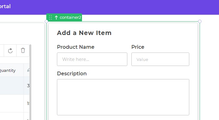
Container
The Container control enables you to arrange your controls in a simple and easy-to-navigate layout. It is typically useful when you have large and complex forms that can be made easier by allowing absolute resizing in pixels within the parent Container size.
info
This control is only available in the Free Flow Editor which has enhanced functionality for managing controls on a grid layout.
Properties
| Property | Description |
|---|---|
| Background color | Set the background color of the Container. You can enter a custom hex code value or use available themes. |
| Image * | Add an image to the Container. |
| Image Fit | Choose how the image appears in the Container: container style or cover style. |
| Box Shadow | Add a shadow to the Container box. Toggle to enable or disable the box-shadow. |
| Max-W and Min-W | Set the maximum and minimum width of the Container. |
| Alignment | Align the controls within the Container: start, end, center, space between, or aligned to baseline. |
| Overflow | Control whether the content can scroll outside the Container box or remains visible within borders. |
Border
| Property | Description |
|---|---|
| Border | Choose the type of border for the Container: All borders, Top, Right, Bottom, or Left. |
| Width | Set the border width in pixels or any other unit according to your selection. |
| Style | Choose the border style: solid, dashed, or dotted. You can also select None for no border. |
| Color | Specify the color to be used for the borders. |
| Radius | Adjust the radius of the border edges to give rounded corners. |