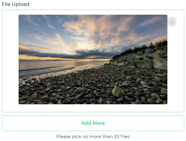
The File Upload control enables users to select and upload files from their local device. It is highly configurable, supporting specific file types, multiple selection modes, and integrated storage options.
File Upload Text – The actual text shown on the upload button, e.g., "Upload Files".File types – Allowed file extensions/types. Leave blank to allow all. Example: ["jpg","png","svg","pdf"] or .jpg, .png, .svg, .pdf.Selection Type – Choose between Single File, Multiple Files, or Directory. Lets users upload one file, multiple files, or all files within a selected directory.Sample file – This file is used as a reference. Whenever the file upload control is referenced in the builder, the sample file will be used for the output.Add-ons Property Description Tooltip Text displayed when the user hovers over the control. Description Additional inline guidance or help text. Label The actual text shown on the control. Annotations Enabled when File Type is Image. Allows annotation of images for highlighting and changes. Available in mobile apps with an Edit file option. Save To Gallery When enabled, images uploaded via the control are saved to the device's local gallery. Add Timestamp to filename Automatically appends a unique timestamp to the uploaded file's name to prevent naming conflicts.
Interaction Validation Property Description Required Ensures the field is not empty. Min files Minimum required files. Leave blank or set to 0 for no minimum. Max files Maximum allowed files. Also referred to as No. of Files limit. Min size Minimum total upload size. Leave blank or set to 0 for no minimum. Max size Maximum allowed size per file or total upload size. Advanced File Filter Whitelist or Blacklist specific signatures: Filter Mode , File extensions , Magic Numbers . Custom Validation Default is set to no validation.
Read only – Makes the control non-editable.Generate Base64 Data – Toggle on this property to get the base64 data of the uploaded file(s) in the output of the control.Submit Data – Defines if the controls's value should be submitted, with options like Always, Never, and Not when Hidden.Upload from – Choose between File Manager, Camera, or both as the upload source.Upload file to DronaHQ Storage – When enabled, files are uploaded to DronaHQ storage.Replace file with same name - Overwrites an existing file if it has the same name as that of the uploaded file.Make file public on upload - Makes the uploaded file publicly accessible.Upload to folder - Save the uploaded file directly into a chosen folder within DronaHQ storage.Events value_select – Occurs when a file is selected or removed, influencing the control's output.Appearance Visibility – Controls whether the control is displayed or hidden in the UI.Show Image Files Preview – Enables or disables preview thumbnails for uploaded image files.Theme – Sets the background color of the control.Layout – Defines the visual arrangement and appearance of the file upload control.Close Button Color – Specifies the color of the close button using a color picker.Font – Configures the text font settings, including size, weight, and color.Advanced Hide on Desktop: Hides the file upload control when the app is viewed on desktop devices.Hide on Mobile: Hides the file upload control when the app is viewed on mobile devices.Dynamic Height: Automatically adjusts the control’s height based on its content.Maintain Space when Hidden: Keeps the layout spacing intact even when the control is hidden.Max Height: Sets the maximum height the file upload control can expand to.