Image Menu Grid
The Image Menu Grid control is a Navigation control that provides a graphical interface for the navigation menu in your app.
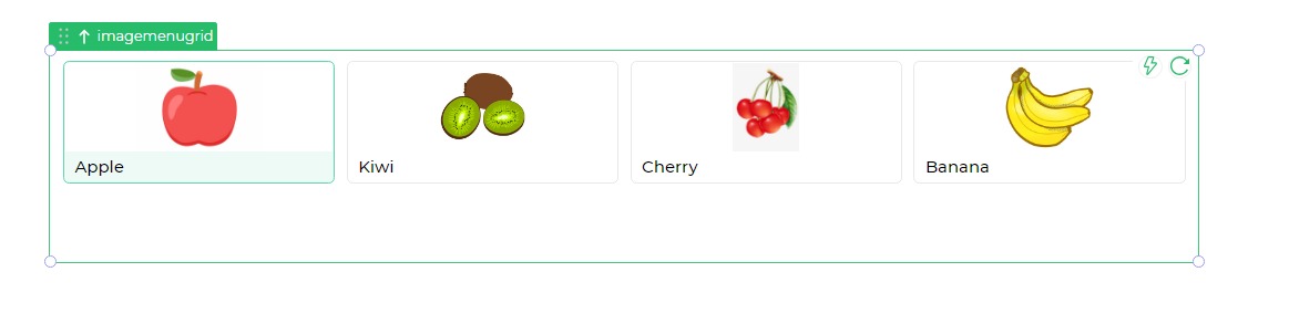
It is typically useful when you want to provide navigation between pages/screens by using a visually appealing interface.
Properties
| Property | Description |
|---|---|
| Border Color | Determines the border color for all images in the menu grid. |
| Background Color | Sets the background color for the entire menu grid. |
| Image Background Color | Configures the background color for the images, either solid or gradient. |
| Image Height | Specifies the height of the images in pixels. |
| Border Radius | Defines the border radius, giving a curve to the border. |
| Image Fit | Controls how the image fits within its container in the menu grid. Options: Fill, Cover, Contain, None. |
| Text Style | Customizes the style of text associated with each image. Includes size, weight, alignment, and color. |
Layout on Device
Determines the number of columns for various devices to optimize the layout.
Conditional Data
| Property | Description |
|---|---|
| Text | Describes the text displayed below each image in the container. |
| Select Image | Allows selection of an image from a source location. |
| Action | Specifies the navigation action, with or without validation. |
| Navigate to | Determines the page/screen to navigate to upon selecting the image. |
| Transition | Specifies the transition style for navigation, such as Slide to Left or Slide to Right. |
| Selected | Determines whether the image is initially shown as selected when the form runs. |
| Reset Target Screen | Specifies if the Target Screen should reset upon navigation. |