Layout and Columnar Layouts
This component can be found under Advanced editor .
When creating apps, the layouts enable you to arrange the form components in a logical order well suited to the different devices. It enables you to easily design complex apps in a manner that it becomes easily navigable to the users of any of the devices.
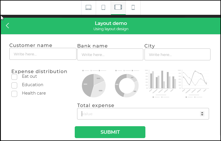
If you design a form with a single column it would be a great user experience for a user accessing it on mobile with standard screen size. However, the same might not be true for a user on a desktop or even a widescreen tablet. In such scenarios, two or even more columns can be a good option for ease of use.
DronaHQ provides the Layouts feature in the Controls section. There are different layouts that allow you to design your forms in a multi-column format. Other controls can be added to the layouts to enable you to make even a complex application easy to use on any kind of device.

Columnar layouts
like the One Column layout, the Two Column layout, and so on. The Layout container is of type “layout”. When designing complex forms it is recommended that any of the columnar layouts mentioned below should be added to a layout and designed further. Further on you can also add the Layout container to any columnar layout which would be useful to further add the columnar layout and design complex and multilevel forms.
Properties
Event Properties
| Event | Description |
|---|---|
| Stop propagation | Prevents events from being passed to parent controls. When enabled, only the child control's events are triggered. |
| Listen child click | Allows the parent control to listen to and respond to click events on its child controls. |
UI Properties
General Properties
| Property | Description |
|---|---|
| Outline | Defines the outline of the control. |
| Background | Sets the background color of the control. |
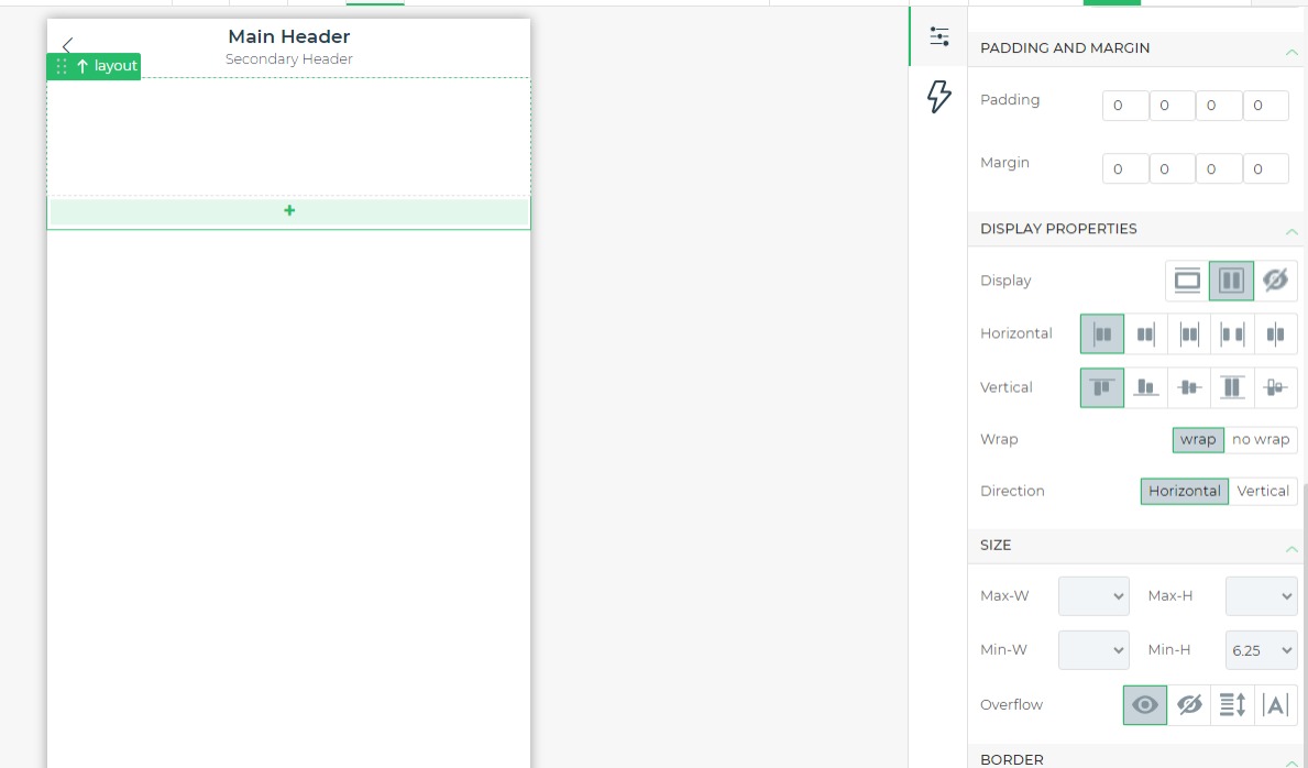
| Padding | Specifies the padding within the control. |
| Margin | Sets the margin outside the control. |
Display Properties
| Property | Description |
|---|---|
| Display | Sets how the control is displayed (e.g., block, flex, hide). |
| Horizontal | Aligns content horizontally (start, end, center, space between, baseline). |
| Vertical | Aligns content vertically (start, end, center, stretch, baseline). |
| Wrap | Specifies whether content should wrap (wrap, no wrap). |
| Direction | Defines the direction of content flow (horizontal, vertical). |
Size Properties
| Property | Description |
|---|---|
| Max-W and Max-H | Sets the maximum width and height of the control. |
| Min-W and Min-H | Sets the minimum width and height of the control. |
| Overflow | Controls how overflow content is handled (visible, hidden, scroll, auto). |
Border Properties
| Property | Description |
|---|---|
| Border | Specifies the sides of the control where borders will appear (all, top, bottom, left, right). |
| Style | Sets the border style (none, solid, dashed, dotted). |
| Color | Defines the border color. |
| Radius | Sets the border radius for rounded corners. |
| Box Shadow | Applies shadow effects around the control. |
Columnar Layouts
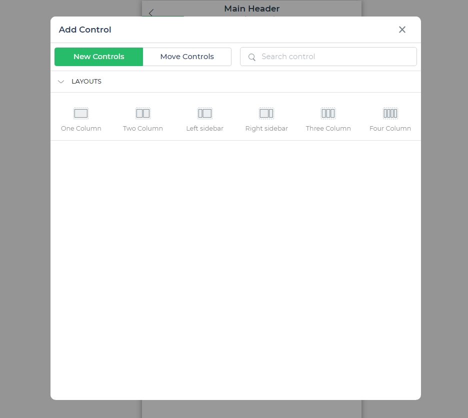
Click on the " + " icon in the control to add different columnar layouts

- One Column: Adds a single column for controls, displayed as a single column with multiple rows. Only a single column is visible in Mobile portrait view.
- Two Column: Adds two equal-sized columns. Two columns are visible in Desktop, tablet, and Mobile landscape views, but only a single column in Mobile portrait view.
- Left Sidebar: Two columns with the left column smaller (1:3 ratio) than the right column. Visible on any device type.
- Right Sidebar: Two columns with the right column smaller (1:3 ratio) than the left column. Visible on any device type.
- Three Column: Adds three equal-sized columns. Three columns are visible in Desktop, tablet, and Mobile landscape views, but only a single column in Mobile portrait view.
- Four Column: Adds four equal-sized columns. Four columns are visible in Desktop, tablet, and Mobile landscape views, but only a single column in Mobile portrait view.
How to Use Layout Control
In the Layout control section, a Layout control and multiple columnar layout types are available.
- Start by adding a Layout control, then add columnar layout types to it. Add controls to these columns as needed.
- Controls like Text controls cannot be added directly to a Layout control, but can be added to columnar layouts within the layout control.
- You can add a Layout control to a columnar layout, then add further columnar formats to this layout for more complex designs.
An important feature of columnar layouts is the ability to set separate settings for different devices (desktop, mobile, tablet). Under the Columns tab in Properties, you can define column settings for each device type, ensuring optimal layout for any screen size.
Preview
