Link
The Link control is a Custom control designed to create links either from URLs or to different pages while enabling further actions. It proves useful when you want to incorporate links into your application and define specific actions triggered by clicking those links.
Content
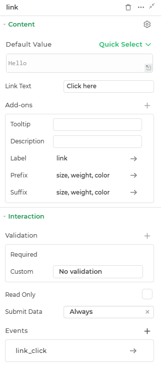
Default
This is where you can provide the default link value for the Link control.
Link Text
Specifies the text that will appear as the hyperlink on the form.
Add-ons
| Add-on | Description |
|---|---|
| Tooltip | Provides helpful hints or extra information on hover. |
| Description | Adds descriptive text beneath options or sections. |
| Label | Displays labels for specific options or sections. Configurable with size, weight, and color. |
| Prefix | Adds an icon or text before the field content. Configurable with size, weight, and color. |
| Suffix | Adds an icon or text after the field content. Configurable with size, weight, and color. |
Interaction
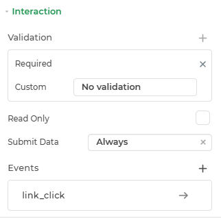
| Option | Details |
|---|---|
| Validation | Add validation rules like required or more to the control. |
| Read Only | Makes the control non-editable. |
| Submit Data | Determines when data is submitted (Options: Always, Never, Not When Hidden). |
| Events | Lets you define logic or actions (like bindings or workflows) that should trigger based on user interaction. |
Events
| Trigger | Description |
|---|---|
| link_click | Actions triggered when you click the link text. You can add Open URL or Navigate to action and other actions as needed. |
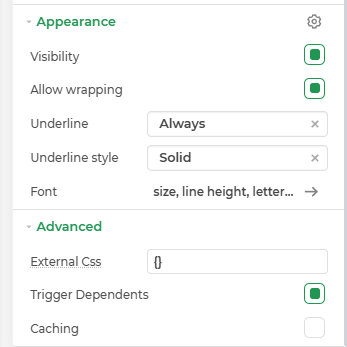
Appearance
- Visibility – Controls whether the element is shown or hidden in the interface.
- Allow Wrapping : Determines if text within the element should wrap to the next line when it reaches the container’s edge. -Underline Style: Defines the appearance of the underline, such as solid, dashed, or dotted.
- Font – Defines the appearance of displayed text. Controls the font size, boldness, color, and alignment of the output text.
Advanced Settings
- External CSS: Add custom styles to the Link control.
- Trigger Dependents: Automatically invoke linked controls or workflows.
- Caching: Enable caching to store frequently used inputs.
Control Outputs
The outputs from the Link control, represented by the placeholder {{link}}, can be referenced in other controls, data queries, or JavaScript functions using the control's unique name.
| Output | Description |
|---|---|
| link | Represents the link present in the Link control. |