Numeric
The Numeric Control is a versatile tool used to gather numeric data or perform calculations based on user inputs. It can handle various numeric formats, such as whole numbers and decimals, making it suitable for a wide range of applications.

Content
- Properties
- Description
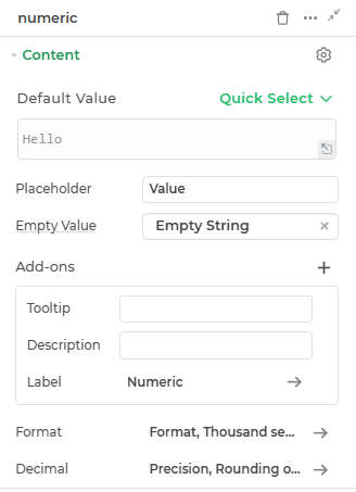
Default Value
This is where you can provide the default numeric value for the numeric control.
Placeholder
Provide a placeholder text to guide the user.
Empty Value
Select here what you want to show in the input area when it's empty.
Format
Different properties to decide the format for the value being displayed can be configured here, like Format, Digit-Grouping and Separator .
| Property | Description |
|---|---|
| Format | This property segment helps user to determine to keep the numeric format suitable for the app, provided with options like Normal, Accounting, and Currency also can determine whether to make the thousand separator as comma, dot, space and quote. |
| Digit-Grouping | It specifies the system according to which the digit should be grouped together. We can select a value among International, Indian and Myriad (East Asia) (Myriad-based system). |
| Separator | Specifies what separator should be used for grouping of digits. |
Decimal
In this property segment you can define the number of digits after the decimal point to be displayed for decimal precision. Use 0 for no decimal points.
Add-ons
| Add-on | Description |
|---|---|
| Tooltip | Provides helpful hints or extra information on hover. |
| Description | Adds descriptive text beneath options or sections. |
| Label | Displays labels for specific options or sections. Configurable with size, weight, and color. |
Along with Rounding Options (Floor/Round/Ceiling) and Decimal Separator, the numeric control has the option to Show Pad Decimal to include trailing zeros.
Interaction
- Properties
- Description
| Property | Description |
|---|---|
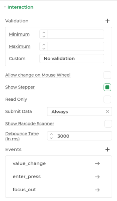
| Validation | Defines how the input is validated. Includes several validation types: Required (ensures the field is not empty), Minimum and Maximum (limits input numeric - value). |
| Allow change on Mouse Wheel | When enabled, the value can be modified using the mouse wheel while the control has focus. |
| Read Only | Makes the input field non-editable. The user can view the content but cannot modify it. |
| Submit Data | Determines whether the field's value should be included in form submission. Options include Always, Never, and Not When hidden. |
| Show Barcode Scanner | Displays a barcode scanner icon that lets users input values by scanning barcodes. |
| Debounce Time (In ms) | Sets a delay (in milliseconds) to wait after user input before triggering events like search or API calls. Helps reduce unnecessary calls. |
| Events | Allows configuration of actions (like workflows or bindings) to trigger based on user interactions, such as input change, focus, or press enter. |
Events
| Trigger | Description |
|---|---|
| value_change | Triggers when you change the value in the Numeric control. Initiates subsequent actions with the same flow as used for action buttons, list controls, etc. |
| focus_out | Triggers when focus moves to another control, initiating the action flow. |
| enter_press | Triggers when the Enter key is pressed after inputting data in the Numeric control. |
Appearance
- Visibility: Toggles the visibility of the control at runtime.
- Show clear: Adds a clear (✕) icon inside the input field to allow users to clear the value.
- Alignment: Specifies the position of the value in the control.
- Border: Choose the color of the Container box. You can use a custom hex code or select one from the available themes in the builder.
Advanced
- External CSS: Add custom styles to the control.
- Trigger Dependents: Automatically invoke linked controls or workflows.
- Caching: Enable caching to store frequently used inputs.
Control Output
The outputs from the Numeric control, represented by the placeholder {{numeric}}, can be referenced in other controls, data queries, or JavaScript functions using the control's unique name.
| Output | Description |
|---|---|
| numeric | Represents the numeric value available in the Numeric control. |