Panel
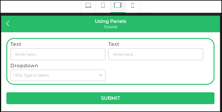
The Panel control groups multiple controls for easy management, enabling unified conditions or validations. It optimizes control layout based on user device screens for enhanced adaptability.
Properties
| Property | Description |
|---|---|
| Background Color | Set the background color of the panel. Choose a hex code or use predefined themes. |
| Box Shadow | Add or remove a shadow to the panel box. Toggle to enable or disable the box shadow. |
| Max-W | Define the maximum width of the panel. |
| Min-W | Specify the minimum width of the panel. |
| Alignment | Align controls within the panel. Options include start, end, center, space between, or baseline alignment. |
Border
| Property | Description |
|---|---|
| Border | Choose the type of border: All borders, Top, right, bottom, or left borders. |
| Width | Set the border width in pixels or another selected unit. |
| Style | Define the border style: solid, dashed, dotted, or None (if no border is desired). |
| Color | Specify the color for the borders. |
| Radius | Adjust the radius of the border edges, as demonstrated in the illustration below. |