Phone
The Phone control is designed to receive phone numbers in a composite format, divided into two distinct fields. These fields can be stored in separate columns of a sheet, treating them as individual entities. The Phone control comprises two components - Country Code or Prefix and Phone number, providing unique accessibility for each part of the phone number.
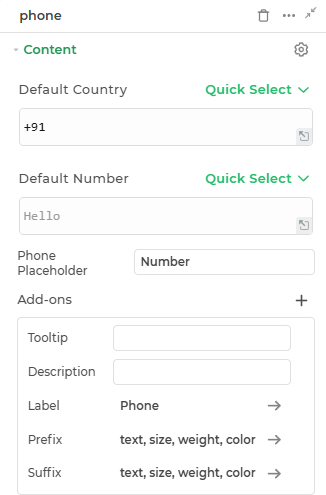
Content
Binding Data Options
The Phone control consists of two parts: the country code and the phone number. It accepts single inputs for both the country code and the phone number.
Country Code
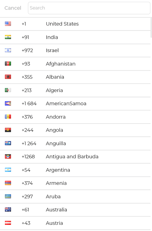
The Country Code field allows users to input their country code as a string, e.g., +1 for the United States, +44 for the United Kingdom, etc.
Phone Number
The Phone Number field allows users to input their phone number as a number, e.g., 1234567890.
Users can directly enter the country code and phone number in their respective fields without using an array.
Phone Placeholder
A prompt that gives a hint to the user about the expected input in the Phone field.
Add-ons
| Add-on | Description |
|---|---|
| Tooltip | Provides helpful hints or extra information on hover. |
| Description | Adds descriptive text beneath options or sections. |
| Label | Displays labels for specific options or sections. Configurable with size, weight, and color. |
| Prefix | Adds an icon or text before the field content. Configurable with size, weight, and color. |
| Suffix | Adds an icon or text after the field content. Configurable with size, weight, and color. |
Interaction
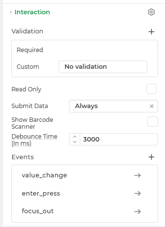
| Property | Description |
|---|---|
| Validation | Defines how the input is validated. |
| Read Only | Makes the input field non-editable. The user can view the content but cannot modify it. |
| Submit Data | Determines whether the field's value should be included in form submission. Options include Always, Never, and Not When hidden. |
| Show Barcode Scanner | Displays a barcode scanner icon that lets users input values by scanning barcodes. |
| Debounce Time (In ms) | Sets a delay (in milliseconds) to wait after user input before triggering events like search or API calls. Helps reduce unnecessary calls. |
| Events | Allows configuration of actions (like workflows or bindings) to trigger based on user interactions, such as input change, focus, or press enter. |
Events
| Trigger | Description |
|---|---|
| value_change | Occurs when there is a modification in the Advance Map control's value. To control the frequency or speed of the change event, you can utilize the debounce property associated with the control. |
| focus_out | Occurs when the control loses focus, typically when the user clicks outside the control. It allows you to perform actions or handle specific behavior when the focus is no longer on the element. |
| enter_press | This event indicates the pressing of the Enter key when entering data into your Currency control. |
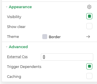
Appearance
- Visibility: Toggle the visibility of the control at runtime.
- Show Clear: Adds a clear (✕) icon inside the input to allow users to quickly reset its value.
Advanced Settings
- External CSS: Add custom styles to the Input text control.
- Trigger Dependents: Automatically invoke linked controls or workflows.
- Caching: Enable caching to store frequently used inputs.
Control Outputs
The outputs from the Phone control, represented by the placeholder {{phone}}, can be referenced in other controls, data queries, or JavaScript functions using the control's unique name.
| Output | Description |
|---|---|
| phone | Represents the phone number available in the Phone control. |