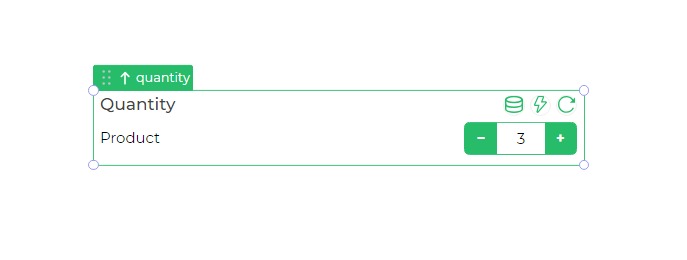
Quantity
The Quantity control is an advanced input element designed to specify the quantity of a particular product or any other item. It is commonly used in microapps where users need to input a numeric quantity for various purposes.

Binding Data Options
The Quantity control requires two different pieces of data to display:
Static Data Option
To input data into the Quantity control, you need to specify the binding data in two sections:
{
    "title": "Product Title",
    "value": 5
}
This JSON object includes the product's title as a string and the associated quantity as a number.
Properties
| Property | Description |
|---|---|
| Theme | Allows customization of the control's color, either using a custom hex code or choosing from available themes. |
| Text | Displays the item's label, indicating the element for which the quantity is being entered. |
| Properties | Customizes the text label's appearance, enabling size, weight (Light, Normal, Bold, Extra Bold, X Extra Bold), and color changes. |
| Dark Icons | Sets the color of the icons to increase and decrease the quantity to a darker shade, typically black. |
Control Outputs
The Quantity control outputs data associated with the product or item, represented by the placeholders {{quantity.title}} for the product's title and {{quantity.value}} for the entered quantity.
| Output | Description |
|---|---|
| {{quantity.title}} | Represents the title or label of the product associated with the entered quantity. |
| {{quantity.value}} | Indicates the entered quantity for the corresponding product. |
Events
| Trigger | Description |
|---|---|
| value_change | Activates upon modification in the value of the respective control, typically used for numeric input. |
| enter_press | Triggers upon pressing the Enter key after inputting data in the Quantity control. |
| focus_out | Occurs when the control loses focus, typically when the user clicks outside the control. |