Range Picker
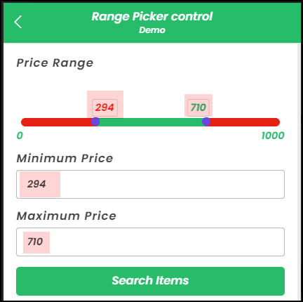
The Range Picker control is used to define and select a range of values, providing users with a customizable range selection interface. It allows binding to two options - Min Value and Max Value in a numerical data format.
Content
Binding Data Options
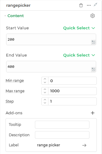
Range Picker control accepts number format to display data. There are two different numericdata options: Min Value and Max Value.
Static Data Option
Utilize the Bind Data option to set predefined start and end range. For instance:
Start Value
50
End Value
500
Min-range
Defines the minimum value allowed within the control.
Max-range
Defines the maximum value allowed within the control.
Step
Specifies the increment/decrement value for the control.
Add-ons
| Add-on | Description |
|---|---|
| Tooltip | Provides helpful hints or extra information on hover. |
| Description | Adds descriptive text beneath options or sections. |
| Label | Displays labels for specific options or sections. Configurable with size, weight, and color. |
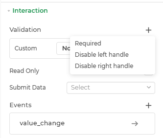
Interaction
| Property | Description |
|---|---|
| Validation | Adds rules to input validation. Options include Required, Disable left handle, and Disable right handle for specific control behavior. |
| Read Only | Sets the field to a non-editable state while still displaying the content to the user. |
| Submit Data | Determines when data should be submitted. Options may include conditions like Always, Never, and Not when hidden. |
| Events | Lets you define logic or actions (like bindings or workflows) that should trigger based on user interaction. |
Event
| Trigger | Description |
|---|---|
| value_change | Occurs when there is a modification in the Range picker control's value. To control the frequency or speed of the change event, you can utilize the debounce property associated with the control. |
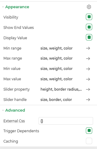
Appearance
| Property | Description |
|---|---|
| Visibility | Toggles the visibility of the slider component in the app interface. |
| Show End Values | Displays the minimum and maximum values at either end of the slider for better range context. |
| Display Value | Shows the current selected value(s) on the slider while interacting. |
| Min range | Allows styling the minimum selectable range on the slider. |
| Max range | Allows styling the maximum selectable range on the slider. |
| Min value | Lets you apply visual styles. |
| Max value | Lets you apply visual styles. |
| Slider property | Customizes overall slider design, and other visual properties. |
| Slider handle | Modifies the appearance of the slider handle. |
Advanced Settings
- External CSS: Add custom styles to the Button control.
- Trigger Dependents: Automatically invoke linked controls or workflows.
- Caching: Enable caching to store frequently used inputs.
Control Outputs
The outputs from the Range Picker control, represented by the placeholders {{rangepicker.Min_Value}} and {{rangepicker.Max_Value}}, can be referenced in other controls, data queries, or JavaScript functions using the control's unique name.
| Output | Description |
|---|---|
| Min Value | Represents the selected minimum value in the Range Picker control. |
| Max Value | Represents the selected maximum value in the Range Picker control. |