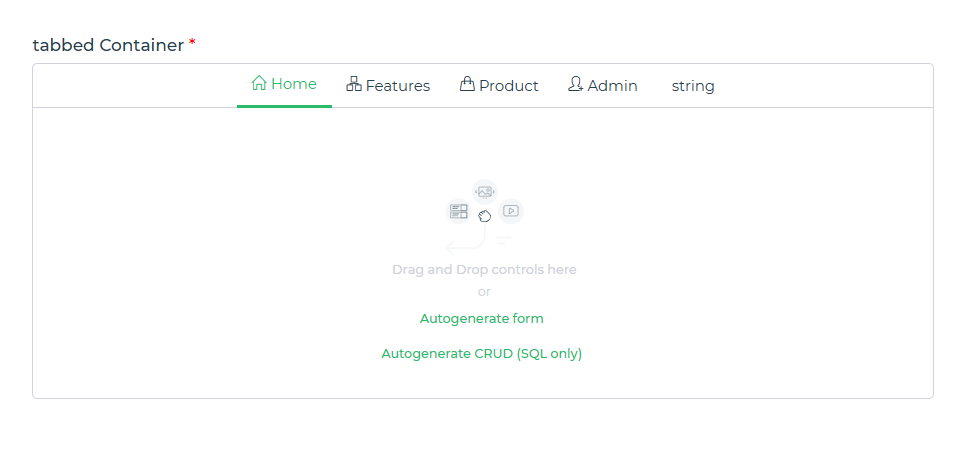
Tabbed Container
The Tabbed Container allows developers to organize and display content in a structured, tabbed interface, enhancing user experience by keeping the app's layout clean and intuitive.
A Tabbed Container is a UI component designed to segregate content into multiple tabs. Each tab acts as a unique section, providing users with the ability to switch between content or functionalities seamlessly.
It is particularly useful in scenarios where you need to:
- Display grouped information under different categories.
- Build dashboards with different data views.
- Organize forms or settings into sections for better navigation.
- Create multi-step workflows with clear separation between steps.
Content
The Tabbed Container’s configuration is comprehensive, offering various ways to define and manage its content.
Content Configuration
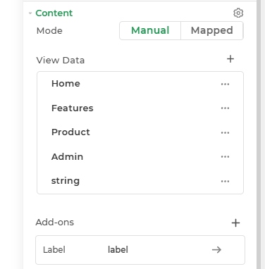
Mode
Expected value:
[
  {
    "value": "home",
    "label": "Home",
    "icon": "icon-home",
    "image": ""
  },
  {
    "value": "features",
    "label": "Features",
    "icon": "icon-organization",
    "image": ""
  },
  {
    "value": "product",
    "label": "Product",
    "icon": "icon-handbag",
    "image": ""
  },
  {
    "value": "admin",
    "label": "Admin",
    "icon": "icon-user-follow",
    "image": ""
  }
]
- Manual: Allows developers to manually configure the tabs and their corresponding content.
- Mapped: Dynamically generate tabs by mapping data from external sources.
- View Data: Preview the data being rendered in the tabs to ensure accuracy.
Add-ons
- Tooltip: Add tooltips to provide contextual information about each tab.
- Description: Include detailed descriptions for better user understanding.
- Label: Customize the labels for each tab such as its size, height, color and alignment.
In the Tabbed Container, If the tab value is altered, then the associated controls will be automatically removed. This is because the system maps controls based on the value key, not the label.
It is best to:
- First set the tab value and then inject the controls accordingly to ensure they persist.
- Modify the tab label as it is safe and will not affect the controls.
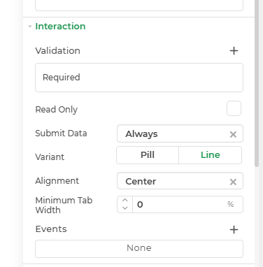
Interaction
Interaction settings provide flexibility in handling user actions and input validations.
| Property | Description |
|---|---|
| Validation | Defines rules for user input. Required: Marks specific fields or tabs as mandatory. Read Only: Restricts users from editing specific tabs or fields. |
| Submit Data | Determines when data should be submitted: Always: Data is submitted every time. Never: Data is never submitted. Not When Hidden: Data is submitted only when the field/tab is visible. |
| Variant | Specifies the tab style: Pill: Rounded tab design. Line: Minimalist line-style tabs. |
| Minimum Tab Width | Defines the minimum width for a tab to maintain layout consistency. |
| Alignment | Controls tab positioning to: Center Left Right Normal:as Default alignment behavior. |
Events
tab_change: Trigger custom events or actions when a user switches between tabs.
Appearance
| Property | Description |
|---|---|
| Visibility | Controls the visibility of the entire container or specific tabs. |
| Box Shadow | Adds a shadow effect to enhance the container’s depth and visual appeal. |
| Tab Customization | Customizes tab appearance such as Size, Weight, Color, Background Color and more. |
| Active Tab Customization | Modifies the active tab's appearance:such as Size, Weight, Color, Background Color and more. Differentiates the active tab with a unique background. |
| Background | Controls the container’s background such as Size, Weight, Color, Background Color, Opacity, and more. |
| Border | Defines the container’s border styling: Border such as Sets border visibility, Width, Style of the border as solid, dashed, or dotted styles, Color, Radius, and more. |
Advanced Settings
For power users and developers, the advanced settings offer additional control over the Tabbed Container.
External CSS Inject custom CSS styles for granular control over the design and behavior of the tabs.
Trigger Dependents Set up dependent actions or triggers based on user interactions with the tabs.
Caching Enable caching to store data locally and improve app performance.
Control Outputs
The outputs from the Tabbed Container control, represented by the placeholder {{tabbedcontainer}}, can be referenced in other controls, data queries, or JavaScript functions using the control's unique name.
| Output | Description |
|---|---|
| tabbedcontainer | Represents the user-selected value from the selected options of the Tabbed Container control. |