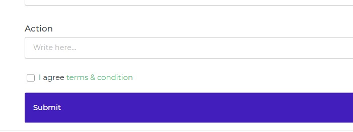
Terms and Conditions
The Terms and Conditions control is used to display a declaration statement and retrieve agreement from the user for specified terms and conditions before proceeding. It is checkbox type control specially for terms and condition with link addition feature.

Binding Data Options
The Terms and Conditions control binds to boolean data, representing the agreement or disagreement with the provided conditions.
Static Data Option
Using the Bind Data option, you can set an initial state for the control. For example:
false
Properties
| Property | Description |
|---|---|
| Declaration | Represents the declaration text, indicating user agreement with the terms and conditions. |
| Terms URL | Defines the URL where the detailed terms and conditions can be found. Including the http:// or https:// protocol is essential, as it ensures proper interpretation by the browser, guiding it on how to resolve the URL relative to the current page. |
| Error Message | Displays a message when the user fails to agree to the terms and conditions, requesting agreement to proceed. |
| Theme | Sets the theme or color scheme for the Terms and Conditions control. |
Control Outputs
The outputs from the Terms and Conditions control, represented by the placeholder {{termsandconditions}}, can be referenced in other controls, data queries, or JavaScript functions using the control's unique name.
| Output | Description |
|---|---|
| termsandconditions | Represents the user's agreement or confirmation to the terms and conditions. |
Events
| Trigger | Description |
|---|---|
| value_select | Occurs when there is a change in the value of the respective control, typically triggered by selecting another option or inputting a new value. |