Text
The Text Control is a versatile component designed to display content in either Markdown or Plain Text format. It supports rich text formatting, links, lists, headings, code blocks, and other Markdown syntax. It has additional properties such as dynamic height, Show/Hide on mobile, Show/Hide on Desktop, and Maintain space when hidden property in Freeflow editor.
Content
Type
| Type | Description |
|---|---|
| Markdown | A lightweight markup language used to format text with plain syntax. It converts easily to HTML for styled content. |
| Plain Text | Unformatted text that contains no styling or special formatting. It displays exactly as typed, without interpretation. |
Add-ons
| Add-on | Description |
|---|---|
| Tooltip | Provides helpful hints or extra information on hover. |
| Description | Adds descriptive text beneath options or sections. |
| Label | Displays labels for specific options or sections. Configurable with size, weight, and color. |

Binding Data Options
To populate the Text control with data, you can use the Bind Data option, which accepts an string data format.

Plain Text
You can utilize this feature to present fixed text content directly within the control, without any styling or structure. For instance, if you wish to exhibit a predefined piece of text within the Text control, you can simply input the desired content into this section.
Consider an example where you want to display an introductory paragraph.
Welcome to our new app! We aim to provide you with an unparalleled user experience.
Markdown
Markdown a lightweight markup language used to format text with plain syntax. It converts easily to HTML for styled content.
Markdown Extension supported
Standard Markdown
Standard Markdown is a lightweight markup language used to format plain text. It allows easy conversion to HTML and supports basic formatting features.
- Syntax
- Output
# H1
## H2
### H3
#### H4
##### H5
###### H6

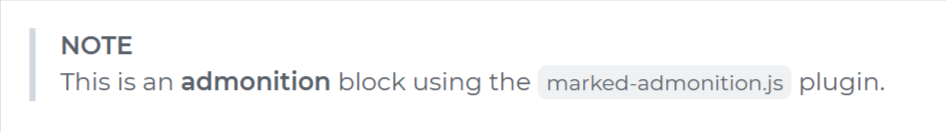
Marked Admonition
Adds support for styled admonition blocks (e.g., Note, Tip, Warning) in Markdown. These visually highlight important content such as alerts or instructions using a block-style layout.
- Syntax
- Output
> **NOTE**
> This is an **admonition** block using the `marked-admonition.js` plugin.
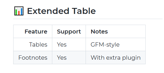
Marked Extended Tables
Enhances default Markdown tables by enabling advanced features such as cell merging (rowspan and colspan), nested elements, and improved layout flexibility.
- Syntax
- Output
## 📊 Extended Table

| Feature   | Support | Notes           |
|---------: |:--------|:----------------|
| Tables    | Yes     | GFM-style       |
| Footnotes | Yes     | With plugin     |
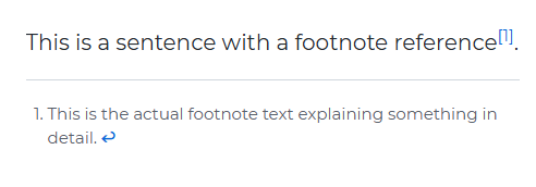
Marked Footnote
Enables GitHub-style footnotes in Markdown for referencing additional information. Footnotes appear as superscripted links with definitions listed at the bottom of the content.
- Syntax
- Output
This is a sentence with a footnote reference[^1].

[^1]: This is the actual footnote text explaining something in detail.
Marked Highlight
Adds syntax highlighting for code blocks in Markdown using libraries like highlight.js or shiki, making code snippets easier to read and visually appealing.
- Syntax
- Output
```js
function greet(name) {
  return "Hello, " + name;
}

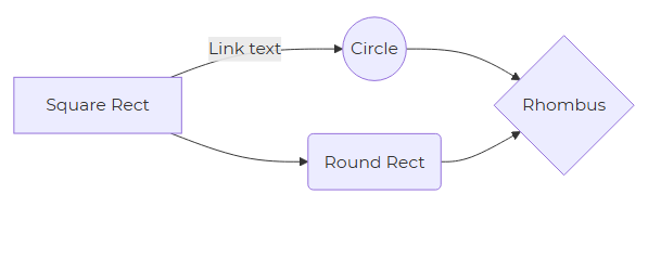
Marked Mermaid
Integrates Mermaid.js support into Markdown, allowing users to embed and render flowcharts, sequence diagrams, and other visualizations using simple text-based syntax.
- Syntax
- Output
```mermaid
graph LR
A[Square Rect] -- Link text --> B((Circle))
A --> C(Round Rect)
B --> D{Rhombus}
C --> D
Appearance
- Visibility: Toggle the visibility of the control at runtime.
- Letter Spacing: Configures the space between characters.
- Line Height: Sets the height of each line of text.
- Font Options: Customize font size, font-weight, font color and font alignment for the font in the text.
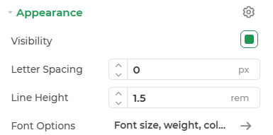
The properties Line Height, Letter Spacing, Font Options are configurable for plain text type data only.
Advanced Settings
- External CSS: Add custom styles to the control.
- Trigger Dependents: Automatically invoke linked controls or workflows.
- Caching: Enable caching to store frequently used inputs.
