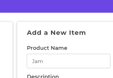
Text Input
The Text Input Control enables users to input or modify text data within a Text column. It is utilized to gather a single line of text, such as a person's name, city, or job title in the case of an employee.
Content
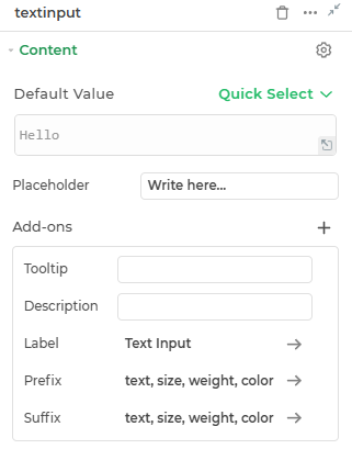
Default
This is where you can provide the default text value for the Text Input control.
Placeholder
Provide a placeholder text to guide the user.
Add-ons
| Add-on | Description |
|---|---|
| Tooltip | Provides helpful hints or extra information on hover. |
| Description | Adds descriptive text beneath options or sections. |
| Label | Displays labels for specific options or sections. Configurable with size, weight, and color. |
| Prefix | Adds an icon or text before the field content. Configurable with size, weight, and color. |
| Suffix | Adds an icon or text after the field content. Configurable with size, weight, and color. |
Interaction
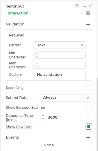
| Property | Description |
|---|---|
| Validation | Defines how the input is validated. Includes several validation types: Required (ensures the field is not empty), Pattern (validates input using predefined formats like Text, Email, Password, URL, or custom regex), Min Character and Max Character (limits input length), Custom (uses logic-based validation expressions), and No validation (disables all validation). |
| Read Only | Makes the input field non-editable. The user can view the content but cannot modify it. |
| Submit Data | Determines whether the field's value should be included in form submission. Options include Always, Never, and Not When hidden. |
| Show Barcode Scanner | Displays a barcode scanner icon that lets users input values by scanning barcodes. |
| Debounce Time (In ms) | Sets a delay (in milliseconds) to wait after user input before triggering events like search or API calls. Helps reduce unnecessary calls. |
| Show Raw Data | Displays the raw unprocessed data value behind the input (useful for debugging or viewing bound values). |
| Events | Allows configuration of actions (like workflows or bindings) to trigger based on user interactions, such as input change, focus, or press enter. |
Events
The Input text control may trigger events when there is a modification in the value of the respective control.
| Trigger | Description |
|---|---|
| value_change | Occurs upon modification in the value of the respective control. |
| focus_out | Triggers when the control loses focus, typically when the user clicks outside the control. |
| enter_press | Activates upon pressing the Enter key while interacting with the Input text control. |
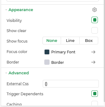
Appearance
- Visibility: Toggle the visibility of the control at runtime.
- Show Clear: Adds a clear (✕) icon inside the input to allow users to quickly reset its value.
- Show Focus: Defines how the input field should appear when focused. Options include None, Line, or Box.
- Focus Color: Customize the color of the focus indicator (line or box) using a hex code or theme color.
- Primary Font: Set the font family for the input text using system or custom fonts.
- Border: Customize the border style of the control, including width, radius, and color.
Advanced Settings
- External CSS: Add custom styles to the Input text control.
- Trigger Dependents: Automatically invoke linked controls or workflows.
- Caching: Enable caching to store frequently used inputs.
Control Output
The outputs from the Text Input control, represented by the placeholder {{textinput}}, can be referenced in other controls, data queries, or JavaScript functions using the control's unique name.
| Output | Description |
|---|---|
| textinput | Represents the text value available in the Text Input control. |