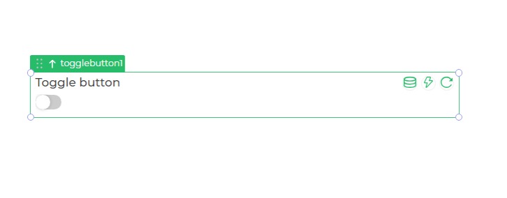
Toggle
The Toggle control provides a binary selection interface, allowing users to switch between two mutually exclusive options or states. It typically showcases an ON/OFF or YES/NO functionality, offering a visual representation of toggling between the options.

Binding Data Options
The Toggle control can be bound to boolean data, representing a switch between two states: true or false.
Static Data Option
The Toggle control can display a predefined static state using the Bind Data option. You can utilize this feature to set an initial state for the toggle switch.
For example, you can represent an initial state as:
true
Properties
| Property | Description |
|---|---|
| Style | Configures the theme of the toggle control. |
Control Outputs
The outputs from the Toggle control, represented by the placeholder {{toggle}}, can be referenced in other controls, data queries, or JavaScript functions using the control's unique name.
| Output | Description |
|---|---|
| toggle | Represents the binary state of the toggle. |
Events
| Trigger | Description |
|---|---|
| value_select | Occurs when there is a toggle the value of the respective control, from Yes to No or True to False. |