Button
The Button Control is an interactive element designed for users to initiate specific actions through a click event.
The Button Control is a user-interactive element primarily utilized to trigger specific actions upon user interaction.
Content
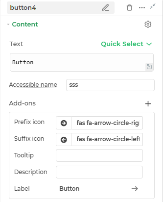
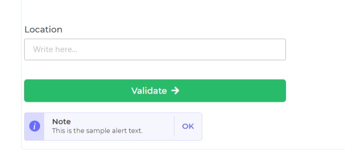
- Text : This is where you can provide the text value for the Button control.
- Accessible Name: An accessible description of the button for screen readers.
Add-ons
| Add-on | Description |
|---|---|
| Tooltip | Provides helpful hints or extra information on hover. |
| Description | Adds descriptive text beneath options or sections. |
| Label | Displays labels for specific options or sections. Configurable with size, weight, and color. |
| Prefix | Adds an icon or text before the field content. Configurable with size, weight, and color. |
| Suffix | Adds an icon or text after the field content. Configurable with size, weight, and color. |
Interaction
| Property | Description |
|---|---|
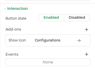
| Button State | Defines the interactivity of the button. Options include Enabled (clickable and active) and Disabled (visibly inactive and non-interactive). |
| Show Icon | Makes you decide on its position and icon-text values. |
| Events | Allows configuration of actions (like workflows or bindings) to trigger based on user interaction, such as button click. |
Events
| Trigger | Description |
|---|---|
| button_click | Occurs upon clicking the button, triggering a specific action. |
Appearance
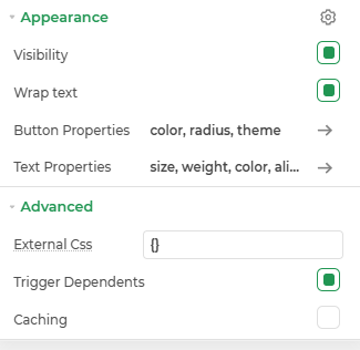
- Visibility: Toggle the visibility of the control at runtime.
- Wrap Text: Enables or disables text wrapping within the control, allowing multi-line display when content overflows.
- Button Properties: Customize the button’s appearance including color, corner radius, and theme to match your design style.
- Text Properties: Configure the text with options for size, weight, color, and alignment for better readability and design consistency.
Advanced Settings
- External CSS: Add custom styles to the Button control.
- Trigger Dependents: Automatically invoke linked controls or workflows.
- Caching: Enable caching to store frequently used inputs.
Using Button Control with DronaHQ
The Button control in DronaHQ is a powerful tool for triggering specific events and actions within your application. By configuring Button controls, you can initiate various actions, from simple on-screen interactions to complex server-side operations, facilitating a wide range of functionalities.
Enhancing User Experience
Buttons in DronaHQ offer an array of capabilities to elevate the user experience. They can be customized to perform actions such as navigating between screens, updating sheets, retrieving data, and implementing custom API actions and database operations.
Configuring Actions
By utilizing the Button control's properties, particularly the button_click event, you can configure actions like calling workflows, updating sheets, retrieving sheet data, implementing custom API actions, and performing database operations.
Use Cases
For instance, you can integrate the SMTP connector to send emails based on user feedback or support requests. Leveraging database actions, you can seamlessly manage customer orders using the PostgreSQL database or configure on-screen actions, such as navigating to specific app screens.
Additional Reading
For a more detailed understanding of Button control features and their functionalities, to trigger actions, both on-screen and on the server side, refer to the article click here.